
Is it just me, or does anyone else think that IKEA are using some wonderful props in their catalogue shoots these days? Last night I stayed up way past my bedtime, flicking through the new 2013 catalogue online and noticed that on many of the pages, my eye was drawn not to the IKEA products, but to the objects in the background. Some of my favourite items are included in the images below.
I really like the simple vintage feel of the luggage tag place settings in this tablescape:

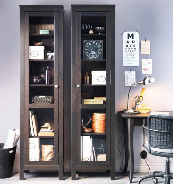
I love the great mix of old and new among the items in these cabinets:
I can almost feel the softness of the brown leather bag on top of this shelving unit. Oh, and I think the wallpaper is pretty too.

Lastly, I have to mention the vintage-looking lamp that features on several pages of the catalogue.
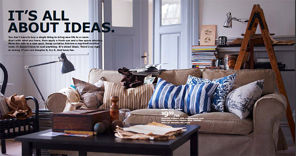
I found myself wondering what kind of Mad Men style office they'd swiped it from but then saw (and kudos to IKEA here) that there was a reason that the lamp appears on more than one page - it's their ARÖD work lamp. I really like its smart bluey grey colour - it would help to make for a soothing office environment.
I do find IKEA handy for standard items like floating shelves and magazine files; though we have tried to keep the amount of IKEA in our house to a minimum, so as not to risk it looking like a page from their catalogue. Having said that, the 2013 collection really does show that it is possible to make their furniture and products sit alongside (and sometimes underneath!) older and cherished objects that you may have collected over the years.
No comments:
Post a Comment