Showing posts with label Paint. Show all posts

19 June 2012

Our pretty blue shed.

We've managed to be quite busy around the house while I've been away from this little blog, so I'll be preparing some posts in the next week or so to show you what we've been up to.

Thanks to my brother, our shed has finally been painted! I decided what colour I wanted to paint the shed a while ago, and finally managed to track it down in Homebase recently. I decided on Coastal Mist by Cuprinol as I thought the pale blue shade would bring some much needed colour into our garden and liven up the drizzly view we have out of our back door for much of the year!

As I said, despite the rainy weather, my lovely brother painted the shed for me while he was staying with us a few weeks ago - he even took Torin out with him so he could "help"! Thanks Ad! Don't they look sweet together!


This is what it looks like now - a little different!


I'm so pleased with it. It's lovely and sunny here today, but even in the rain it really does brighten up the garden.

I decided to paint the hinges white, mainly because I had some paint left over from when we painted the drainpipe on the front of our house (white drainpipes look so much better than faded grey when your house is newly painted white!) and I also thought that black would look too harsh against the blue. What do you think - do you like the white?

I hope it's sunny where you are today!

12 January 2012

In a grey mood.

I finally got too annoyed with the paint swatches that I put on our bathroom wall ages ago. I had chosen three Dulux paints in various shades of grey, and only one of them actually seemed to look like the colour on the card. Therefore, the decision of which paint I actually wanted has still not been made. Anyway, yesterday I picked up a paintbrush and painted over them in the existing colour of the bathroom, just to get rid of them.

Just to remind you, this is the current colour of our bathroom - it's Mineral Haze 4 by Dulux:


I remember when I was having it mixed, the guy in the shop asked if I was sure I wanted this colour as it just looked white to him. At the time I just wanted a tiny hint of colour in there, as I was going for a very neutral look in the whole house. 

Now I'm a bit braver, I want something a little stronger, but as we will have to work with the existing tiles and suite in there, it'll have to be a colour that goes well. I still think a grey would be the best colour to go with, and recently a lot of pictures that have caught my eye have turned out to be walls painted in Farrow and Ball's Pavilion Gray.

However, when I looked at the colour on their website, it seemed quite brown to me - what do you think? Have any of you used this colour?

Image from here.

I think I might just go back to the Dulux website and order a few more grey testers. I think my first choice will be to see what the darker shades of Mineral Haze look like, as I do like the colour I have, but you can only really see that it isn't white when you look at the space where the walls meet the white ceiling.

In this picture, the left wall is painted in Mineral Haze 3, and the right wall is Mineral Haze 2.

Image from here.

Any other suggestions? Do you have any greys that you have used and liked?

7 November 2011

Neat and tidy garden pots.

Today it finally stopped raining for long enough for me to get outside (briefly!) and take a photo of the greenhouse Torin and David put together the other day.


I didn't manage to take a true "before" picture, but you can see in the background of this picture, the plastic greenhouse that this wooden framed one has replaced.

At the moment, there are no plants in the new greenhouse, only empty pots and some of Torin's outdoor toys and garden tools. I'm sure this will change in the Spring though, as we're planning on trying to grow some of our own vegetables next year. We've done this before and really enjoyed the process - especially eating the fruits of our labour, but for some reason it didn't really happen this year. Now we've got a lovely new greenhouse to 'bring on' seedlings, I'm sure we'll manage to grow something, even if it's just a bit of rocket!

For now, the frame is made from treated fir tree wood, but I think I'll paint it in the Spring at the same time as I paint the shed - have a peek here if you want to see the colour I'm thinking of using.

14 September 2011

My new desk wall.

So, as promised, a little peek at some of the painting I managed to do at the weekend. It really is a little peek I'm afraid, as the rest of the room is just too messy for me to bring myself to photograph. The main reason for this is because I'm planning on painting the woodwork this weekend, and so I haven't put everything back in it's right place just yet, and the ladder and my painting tools are still in the room too.


I'm so pleased with the colour, and it's such a pleasure to sit at this desk and look at a clean, fresh wall that is actually finished! If you remember, it looked like this for a LONG time!

I promise that when the two rooms are completely finished, I'll have a big tidy up and then post some pictures on here. Hopefully this weekend will really help make that happen sooner!

18 August 2011

Decorating with Multistem.

While looking at my desk tidy the other day, it occured to me that the colour scheme for every room in my house can be created by using colours in groups of three, from Orla Kiely's multistem pattern.

Image from here.

For example, in my living room and dining room I've used olive green, red and brown. Although the walls in our bedroom are meant to be a mocha colour, they often look quite pink, and we've also used grey and brown in there. Our bathroom is grey with some brown furniture and blue accessories. In Torin's room the walls that were meant to be Dulux's Nude Glow, are quite pink in some light, and I've also used blue and green in there.

You get the picture. Once I realised that this seemed to be the case, it struck me that it was actually quite a good way to use colour in our house and to also get a cohesive look overall - I've always thought the colours in the multistem pattern go together wonderfully.

Carrying on this idea for the new nursery then, I think I've decided to keep the walls their existing colour (a little bit pink), and use chartreuse and orange (in the form of perhaps a shade of apricot) accents. What do you think? Do you think that combination would make a good room for a little girl?

5 August 2011

Can't stop looking at . . .

Each week, I'll be sharing with you something that has caught my eye. It may be a picture, blog, product or website.

This fabric from VillaNova would be perfect for the new curtains I really want in our living room and dining room.


The Garland fabric from their High Society collection, would go so well in my room in the Cherry colourway (take a look here for a reminder of my chosen paint colours). Wisteria and Olive would be another option - both are lovely and would complement the olive paint and red accessories that are already in the room. It's a shame that it's so expensive because I'm going to need a lot of fabric to replace the curtains we already have - we have high ceilings plus one large window and a back door that need curtains.

Here's a zoomed in version of the fabric so you can see the pattern repeat more easily:


Here's a version that's zoomed in even further so you can see the print in greater detail:

All images from here.

26 July 2011

Under the stairs . . .

I've finally managed to do some more decorating in our dining room! The area under the stairs is now nearly finished - still need to paint the woodwork, but I'll do all of this in one go when I've finished with the emulsion.

Initially I wasn't sure whether to use the darker shade of green on both walls, but I'm really glad I did as it makes the area feel quite cosy.


I also love my new red cushion (it's quite a light red but looks more of a coral colour in this picture) - it was a birthday present from our lovely friends Andy and Anna (thank you guys).  I really like the way the red sits against the olive green.

Here's a little close up of what's on the shelf above the sofa:


I've got a few more walls to go (the ones with lots of shelves with lots of books on them) before I'll have finished in here, but it's slowly coming together. Hopefully I'll be able to share "after" pictures with you before too much longer.

9 May 2011

It's coming along . . .

Hope you all had a good weekend! David took Torin out for the afternoon on Saturday so I could get on with painting the dining room - I wanted to do some more before Torin's birthday party this weekend and I managed to paint two walls. I doubt I'll finish the room by Saturday, but at least I've covered up some of the areas where I used tester pots on the walls!

Here are some before and after shots to show you what I got up to:

Before

This is the top part of the wall that is on the right as you enter our dining room - you can just see the entrance into the living room in the bottom left corner. You can see where David painted down onto the wall while he was painting the ceiling white - I like to do this as it creates a neater finish when painting the walls - it ensures there are no gaps, and it's fine to do if you are going to paint over it with a darker colour.

Can you see that the ceiling in here is wallpapered? The ceilings were already like it when we moved in, and as our walls are plain, I don't mind it too much. It's one of those things that we would ideally change, but in the meantime, at least it's nicer than artex!


After

Here's the same bit of wall - much better don't you agree? The wall is painted in Dulux's Gooseberry Fool 5.


Before

Here's a shot of the walls around the dining room door (you can see where I took the previous picture in the top left corner). We recently replaced the door as the existing one contained dangerous glass panels, which we felt was too much of a hazard with Torin around. As you can see, we've primed but haven't yet painted the door, or the surround - I like to do all the gloss work when I've finished with the emulsion.


After

And the same area looking much much neater after I'd given it 2 coats of emulsion. You can see I've painted onto the door surround a little, but I'm not worried about that as it'll be covered over with gloss soon.


Hopefully I'll be able to get this finished soon, and then I'll show you pictures of the completed living room and dining room.

6 April 2011

My son kiely has good taste.

Sorry that my ability to post has been a bit patchy of late - I'm still painting the living room and dining room and it's taking a while! Plus, Torin has a heavy cold and is taking longer to settle at bedtime, so evenings are flying by at the moment. We're slowly getting there though, so I'll hopefully be able to post some before and after pictures soon.

In the meantime, at the bottom of this post, there's a little peak at the colour of the chimney breast in the living room - cosy huh?

I also wanted to show you the lovely presents that Torin gave me on Sunday for Mothers' Day. David helped him to make me a card (how cute!), and Torin gave me the bag of presents on Sunday morning. As you know, I really like Orla Kiely, so this present was a big hit. The Multicoloured Car Print gift bag contained a set of Multi Scribble Stem Print Postcards and a Multicoloured Stem Print mug.

I think I'll frame some of the postcards and display them in our bedroom (and, probably around the rest of the house!).

31 March 2011

Knock knock . . .

Writing this listening to Tim Christensen's "Honeyburst" album - brilliant! We were introduced to his music when we visited our friend in Denmark, and it's been a firm favourite since - have a listen if you're not familiar with his work.

I'd love to have a wooden front door. Ours is white PVCU with mock lead flashing in it. I know it's not particularly horrid. In fact, it's a major step up from the one we had in our last house - imagine again a white PVCU door, but with a massive stained glass hummingbird in the middle - classy, no?

Anyway, I'd just really love a wooden front door - obviously PVCU doors are very secure, but they just look so out of place on old houses like ours. If we did have a wooden front door, I'd enjoy painting it in a pretty heritage shade like one of these:

Image from here.

Image from here.

Image from here.

Image from here.

Image from here.

24 March 2011

We're actually doing some DIY!

David and I have got the bit between our teeth this week! It began at the weekend, when David painted the ceilings and cornicing in the living room and dining room; now I've painted 2 walls in the living room (it's taking a while as I'm doing it during Torin's naps), and David's nearly finished hanging a new living room door! We've certainly been busy!

I'll post plenty of pictures when we've actually finished, but for now at least, I can show you the paint colours we've chosen, and the door that we bought. 

So, the walls in the living room and dining room are being painted in Dulux's "Gooseberry Fool 5":


and the chimney breasts in both rooms will be painted in Dulux's "Overtly Olive":


We've chosen to have them mixed in the Endurance paint, as it'll be easier to wipe off grubby handprints and pawprints without damaging the finish. There's also more of a contrast when the paint is actually on the wall - they look quite similar here, but Overtly Olive appears much greener in situ.

We replaced the door in the living room because the old door had 15 panels of glass in it. We've been getting increasingly nervous about it as Torin can now open the door himself, and really enjoys slamming it shut too. 

He obviously takes after his mother, as this is what I managed to do to our bedroom door a few weeks ago:


I was thoroughly ashamed - how stupid to slam a glass door (!), as well as a little shocked that this happened. At least we found out without anyone being hurt, that the glass in the doors in our house is not safety glass.

We felt it was really important to change the door as soon as possible, so we bought the "Neptune" door from B&Q:


The plan is to paint it white, so I'll post a picture when it's finished.

10 March 2011

Beautiful balance - aqua and wood.

This picture makes me want to paint my whole house aqua (which isn't quite what I've been planning)!

Image from here.

I also love the way the paint colour mixes so well with the warm tones of the wooden bed. Smart, and lovely!

8 February 2011

Keeping it simple.

Recently, I've been thinking of doing something like this:

Image from Livingetc magazine.

with these:


What do you think?

These mirrors are in our bedroom. Neither were expensive - the round one was from a jumble sale, and I spotted the rectangular one in the window of a charity shop. Although I like the gilded look, we've got a few different types of browns in our bedroom already, and I sometimes wonder if these mirrors as they are, are a bit too much. When I spotted the painted LaMaison mirror in the March edition of Livingetc magazine, I wondered if mine would look good painted the same colour as our walls (Mellow Mocha by Dulux). What do you think? I guess I could go for it, and then strip the paint if I don't like it.

28 January 2011

Can't stop looking at . . .

Each week, I'll be sharing with you something that has caught my eye. It may be a picture, blog, product or website.

I mentioned here, that I was wowed by Ben Fogle's house after seeing it featured in the February issue of Living etc magazine. Well, I have now managed to get hold of some images from that feature, and thought you might like to see them. Fogle lives in his beautiful Victorian house in west London with his wife Marina, their son Ludo and their two dogs.

The airiness of this kitchen is brilliant - I would love to extend our kitchen into our side return and add a glass roof. I think it would be wonderful to look up and see the sky while you were cooking! I also like the fact that although this is a sizeable kitchen, they have created the feel of a a cozy cottage parlour by having a comfortable seating area so close to the run of cupboards.


I love the relaxed feel of this area, as well as the bespoke unit they had made to house their SMEG fridge. Their use of bright colours is really refreshing - wish I was brave enough to have a sofa like that!


Everything in this photo works. The brickwork looks amazing (and so it should - Fogle took months and travelled all over the UK to find the perfect bricks); in the Living etc interview, he says, "I went through thousands of reclaimed bricks to get the 500 we needed." I really like how the bright glassware sings out next to the calm neutrals of the units, the brickwork and the stainless steel of the work surface and range.


What I wouldn't give to have a claw-foot bath! I think they look great painted too. The bath is painted in Farrow & Ball's Down Pipe, which is actually grey, even though it looks quite blue in this picture. Just looking at this picture makes me feel calm - it must be the perfect place to have a relaxing bath.


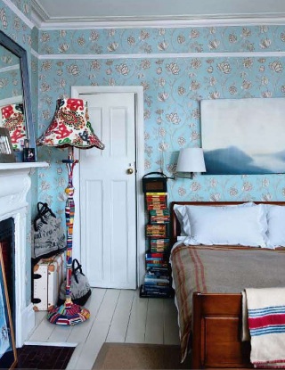
Their bedroom also has a laid back feel to it. The juxtaposition of the masculine and feminine elements of this room works well - the solid wood of the sleigh bed marries beautifully with the pretty wallpaper. I also really like the casual cosiness of the stack of books (on a Ptolomeo 215 bookshelf - available here) and the blanket on the bed. I think however, that if I tried to achieve this look, I would have to make do with just a simple stack of books - the Ptolomeo comes with a rather hefty price tag!

All images from here.

At the end of the Living etc feature, Fogle says, "this house is definitely somewhere I want to hurry home to." I can certainly see why.
Related Posts Plugin for WordPress, Blogger...