28 January 2011

Can't stop looking at . . .

Each week, I'll be sharing with you something that has caught my eye. It may be a picture, blog, product or website.

I mentioned here, that I was wowed by Ben Fogle's house after seeing it featured in the February issue of Living etc magazine. Well, I have now managed to get hold of some images from that feature, and thought you might like to see them. Fogle lives in his beautiful Victorian house in west London with his wife Marina, their son Ludo and their two dogs.

The airiness of this kitchen is brilliant - I would love to extend our kitchen into our side return and add a glass roof. I think it would be wonderful to look up and see the sky while you were cooking! I also like the fact that although this is a sizeable kitchen, they have created the feel of a a cozy cottage parlour by having a comfortable seating area so close to the run of cupboards.


I love the relaxed feel of this area, as well as the bespoke unit they had made to house their SMEG fridge. Their use of bright colours is really refreshing - wish I was brave enough to have a sofa like that!


Everything in this photo works. The brickwork looks amazing (and so it should - Fogle took months and travelled all over the UK to find the perfect bricks); in the Living etc interview, he says, "I went through thousands of reclaimed bricks to get the 500 we needed." I really like how the bright glassware sings out next to the calm neutrals of the units, the brickwork and the stainless steel of the work surface and range.


What I wouldn't give to have a claw-foot bath! I think they look great painted too. The bath is painted in Farrow & Ball's Down Pipe, which is actually grey, even though it looks quite blue in this picture. Just looking at this picture makes me feel calm - it must be the perfect place to have a relaxing bath.


Their bedroom also has a laid back feel to it. The juxtaposition of the masculine and feminine elements of this room works well - the solid wood of the sleigh bed marries beautifully with the pretty wallpaper. I also really like the casual cosiness of the stack of books (on a Ptolomeo 215 bookshelf - available here) and the blanket on the bed. I think however, that if I tried to achieve this look, I would have to make do with just a simple stack of books - the Ptolomeo comes with a rather hefty price tag!

All images from here.

At the end of the Living etc feature, Fogle says, "this house is definitely somewhere I want to hurry home to." I can certainly see why.

27 January 2011

A style icon?

I know, another post about Orla Kiely, but . . .

I couldn't believe it when I opened the March edition of Ideal Home and found an advert from Citroën, showing she'd designed a new range for the Citroën DS3!

I have to admit, as much as I love Orla Kiely's designs, I was a little skeptical - even though I drive a Citroën (C4 Picasso) myself, I worried that she had gone a little too far. A car? Really?

Also, can you have too much of a good thing? Has Orla Kiely become too commercial - is she heading for over-saturation?

However, when I went to the Citroën website, I was pleased to find that the cars actually look pretty good. 


The Irish Times writes:
"The decision to get Orla Kiely to design a special version of Citroën's new DS3 is fitting for a brand whose in-house designers are reckoned to be among the most innovative in the motor industry. It's also fitting for a new car hoping to attract the fashionistas who, up until now, have opted for the retro-styled Mini." 
I guess this makes sense - design and fashion conscious people will certainly look out for them. It's a bonus too, that the Orla Kiely DS3 will be available to the general public, as often this is not the case - Fransico Costa of Calvin Klein and Diane von Furstenburg have both designed one-off Minis this year. Another positive point to this DS3 is that it is obviously something Kiely herself, is passionate about, as she writes on the Citroën website, "As a designer I have always wanted to design a car." 

At least with Kiely's retro styling, the design will look good for years to come. It just seems like such a massive commitment to one designer - by buying one, you really are telling EVERYONE that you like Orla Kiely designs. Another quote from the Irish Times certainly gave me further food for thought:
"Cars inspire envy, pride, passion, disdain. They are a mobile statement of the priorities and prejudices of their owners. To some, they are a garish symbol of financial success; to others, the ultimate fashion accessory."
Anyway, I look forward to seeing one "in the flesh" so to speak, and I'm sure when I do, my green eyes will be flashing. O bliss! O poop-poop! O my! O my! 

What do you think - a style icon? Or orla bit too much?

26 January 2011

Make do and mend: diary makeover.

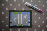
Each year, my grandmother gives me the Dairy Diary for Christmas. This year it came with a mini diary as a free gift, which was lucky as David decided yesterday that he needed an appointments diary to use at work. He thought the mini diary would be suitable for what he needed but didn't like the cover, so he asked me if I would re-cover it for him. This is what it looked like:


This is what it looked like when I had finished:


Here's how I did it:

Using a craft knife, I removed the book from the hardback cover. 


Using the hardback cover as a template, I cut out some fabric that would form the new cover for the diary (leaving 1cm extra all the way around). The fabric was part of a placemat from IKEA, that we already had. 


I then glued the fabric to the hardback cover using a gluepen.


Next, I folded over the 1cm of extra fabric at the top and bottom of the diary, and stuck them down using the gluepen.


Using scissors, I cut right-angles out of the extra fabric at both sides of the diary (at the top and bottom).


I then folded the corners over like a parcel, and stuck the extra fabric down at the sides of the diary.


Lastly, I stuck the book back into the hard cover, by putting glue down the spine, and over the back of the front and last pages (the pages that had previously been stuck to the cover). I then cut out a piece of decorative paper, and stuck this in at the front and the back of the diary to mask some imperfections that had been caused by peeling the book away from the cover.


And there you have it - a diary with a much nicer cover, made with scraps that I already had in the house. The whole thing took about 30 minutes to make, and cost me nothing.

25 January 2011

Quick, neat fix in the kitchen.

For a long time, the chopping boards in our kitchen have looked like this:


As I've mentioned before, we inherited our kitchen from the previous owner, and there is no designated space for chopping boards (or much else actually!). So, the chopping boards lived there, on the work surface, next to the fridge - not ideal. I know they don't look terrible, but they were proving to be a bit of a hazard. If the wooden board at the front was in use, the others would slide down the work surface, which is dangerous - especially now Torin is walking (and running!) around the house. It is especially dangerous as this is where we put things that need to be washed up (no space for a dishwasher!). I'm sure it would have only been a matter of time before something was pushed onto the floor (or onto Torin) by the sliding chopping boards.

The problem would be solved if we could get something to put the chopping boards in - some sort of box or basket. My parents keep their magazines in a rack similar to this one, and last time we were at their house I realised that it would be perfect to house our chopping boards. I set about searching for a suitable magazine holder - the one from MUJI wasn't right for us as I wanted it to be opaque, have sides, and be cheaper!

After a few weeks of searching, I found what I was looking for in TK Maxx. Now, our chopping boards look like this:


So much better!


What do you think? What about you, where do you keep your chopping boards?

24 January 2011

My home: an introduction.

In this mini-series, I'm going to share a selection of my favourite things from each room in our house. Hopefully these posts will provide you with a little insight into my style, and give you a peek into what our house is like.

Living room

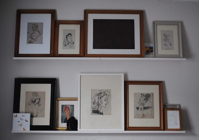
Among the many things in our living room (which I dare say you will get to see in future posts), I've decided to show you my collection of old pencil drawings.


I have a great sentimental attachment to these drawings (the 5 pencil drawings of 1940s women), as they were drawn by my late grandfather during WWII. He loved drawing and practised sketching by copying pictures from magazines, as these pictures show. 

My grandfather died when I was 13, and soon afterwards my grandmother gave me these pictures. I wanted to frame them, so put them into clip frames and hung them on the wall of my bedroom in my parents' house.

When David and I bought our first house together in 2004, I wanted the pictures to be presented in better frames and displayed in a place where everyone who visited our house would see them, so I mounted them in a selection of frames from IKEA, and hung them on the wall going up our stairs.

In our current house, the pictures are given pride of place in our living room above our sofa. We hung picture shelves from IKEA, and the drawings sit on them alongside other pictures, framed greetings cards and maps. 

I've included some close-ups of the drawings so you can see them more easily.


21 January 2011

Can't stop looking at . . .

Each week, I'll be sharing with you something that has caught my eye. It may be a picture, blog, product or website.

This week I was in the home section of John Lewis, when from afar I spotted the tell-tale multi-stem print of an Orla Kiely product, next to some white bed linen. When we got closer, it was as I had hoped - a white bed linen set with the tiny stem motif in white all over it. Lovely!

Image from here.

Like all Orla Kiely bed linen, this set comes in a beautiful box that features the signature multi-stem print, and it was this that caught my eye from across the shop.


I love that on the website, it says, "Please do not throw this box away. This packaging has been designed to be reused and enjoyed!" I'm lucky to have two of these boxes (I'll be featuring the bed linen sets we have in our bedroom in a future post) and they are really well made. They're the perfect size for keeping household paperwork inside them; however, I'm still to put anything inside mine - somehow it feels like I should put something more special than bills in them! I may actually end up cutting them up and framing parts of the print, especially as wallpaper featuring this print is really expensive.


I have said elsewhere that I'm trying to introduce more colour and pattern into our house at the moment. However, a crisp white bed linen set always looks great in a bedroom, and a well made, beautiful set like this, will last for years. I just wish that Orla Kiely king size duvet covers weren't £90! Oh well, I guess I'll just have to dream about this set from underneath the covers I have already.

19 January 2011

A bag is for life, not just for Christmas.

I received this Emma Bridgwater shopping bag (available here), from my grandparents for Christmas and had really enjoyed having it in my trolley at the supermarket and on my shoulder as I walked with Torin down to the greengrocers at the end of our road. I love the old fashioned look of the jute, as well as the fact it has a waxed inside for added durability.


Image from here.
I used it to carry groceries home from the supermarket at the weekend, and as I was rushing (as usual!) in the rain, to get Torin and the shopping into the house, the bag fell off my shoulder and banged onto the tiled floor in our hallway. This would have been fine had I not been using it to carry two bottles of red wine! I soon noticed a river of red seeping out from underneath the bag. A frenzy then ensued - I lifted Torin over the wine torrent, lifted all of the other shopping out of the hallway, ran to the kitchen to grab the kitchen roll, and then began mopping!

Unfortunately, the bag was ruined - full of red wine and broken glass. Even if I had miraculously been able to get the stain out, there was just no way that I would have been able to guarantee removal of all of the glass. Such a shame, though I will enjoy having a good look around for a replacement!

On Emma Bridgwater's website, it says, "Plastic bags are a thing of the past. Use our new Old Bag for all your shopping." I think this is slowly becoming true. With so many shops charging for plastic bags, and some countries like Italy and Kenya even banning them, hopefully plastic bags will soon indeed become a thing of the past. 

I try to take reusable bags with me whenever I go shopping and get so annoyed with myself when I'm at the checkout and realise that I've left my "bags for life" at home, or more likely, in the car! That's not to say that I don't still end up with a pile of plastic bags in my house. I keep shopping bags in a straw basket in our hallway, and there are usually at least 10 of the horrible things in there among the "bags for life" and material shopping bags. I just make sure that I do a regular clear out - most big supermarkets have a recycling bin for old plastic bags near the entrance, so I take them there.

What about you - what do you use to carry your groceries? Do you have any suggestions of bags that could replace my ruined one? 

13 January 2011

Thank you darling.

I got home from taking Torin to his toddler group today, and found an email waiting for me from David. It was a confirmation email saying that he'd bought me a subscription to Livingetc magazine! How lucky am I!

Soon I'll be getting this through my door every month:


He said he'd bought it to help give me ideas for my blog - how sweet!

I was talking to him about it yesterday because I've bought the February issue and LOVE Ben Fogle's house. I can't find any pictures of it other than this at the moment, so I'll do a proper post about it when some images become available.

Thank you darling x

10 January 2011

Kitchen shelf.

We're running out of space in our kitchen. It's only a small room, we do try to keep it tidy, but things just don't seem to fit in there very well. I think the time has come for us to really think carefully about how we store our stuff! We inherited the kitchen from the previous owner, and haven't really done much to it. We added a new sink, and put some shelves up, but not really much else.

Having seen the MOLGER shelf from IKEA a while ago, I really think one would work well in our kitchen. It's meant to be used in a bathroom, but I really like the idea of using things in ways other than they were intended.

Anna from Door Sixteen used hers like this in her city apartment:


I think one would be great above our microwave, underneath the run of wall cupboards. This space currently looks like this:


A shelf under there would be great for storing cooking oils, spices, anything really. It would also do the badly needed job of freeing up cupboard space for us!

I think a trip to IKEA, is in order. I can feel David jumping for joy (!) already!

It's Orla bit beautiful . . .

I was so excited to open this on Christmas Day! My sister and her partner gave me Pattern by Orla Kiely


Although it would look great on any coffee table, it really has more to offer than just its aesthetics. It's a really inspirational read - Kiely writes about how she started her business, what inspires her and her love of colour and pattern, as well as advice on how to mix and match pattern and how to create displays in your own home. 

One of my favourite sections of the book is the "Print Gallery" - 36 glossy pages showing a selection of her prints from the last 10 years - lovely!

Image from here.

There is also a section dedicated to blogs! She writes, "It's a powerful medium where directness and honesty override all else. Genuine and endlessly creative, the blogger's voice is loud and clear." This was just the thing I needed to read, to spur me on to get this thing started!

Thanks Jo and Melanie x

3 January 2011

A new life? A new dawn?

Happy New Year and welcome to my blog!


It's a new year and a fresh start is needed. A new career? A new baby? A new house?


One thing at a time - mustn't get carried away.


How about new walls for the living room?
Related Posts Plugin for WordPress, Blogger...